top of page

LA28 OLYMPIC BRAND
CONCEPT
Flow System
Logo Concept

Designed as a continuous form integrating S, L, A and 8—core requirements representing Summer, Los Angeles, and 2028.


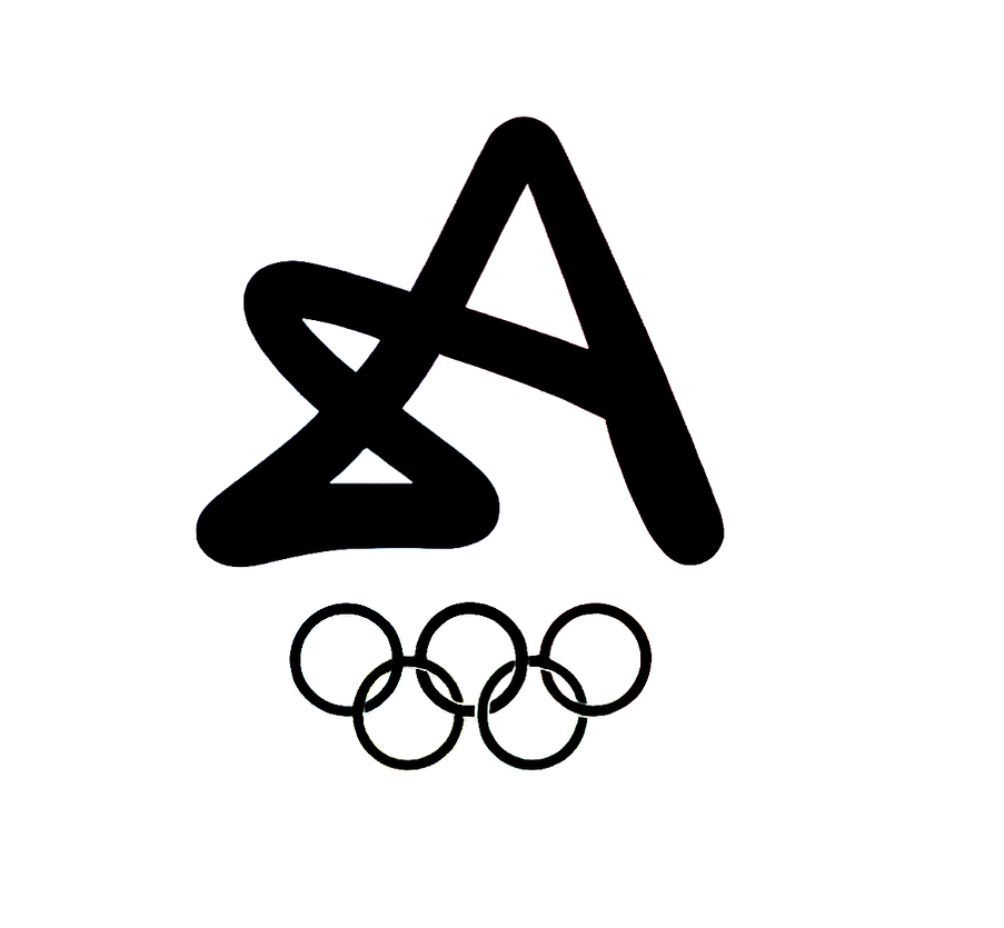
Logo Breakdown
S - Summer
The identity begins with the ribbon forming the letter 'S', representing the Summer Olympic Games. This establishes the first layer of the logo while introducing the continuous ribbon system that carries through the entire mark.
A - Angeles
The final movement completes the iconic 'A', bringing the identity together as the most recognizable form within the system. The result is a single uninterrupted ribbon that simultaneously expresses Summer, 2028, Los, and Angeles without adding or removing elements.
8 - 2028
Without breaking the ribbon, the path loops into the number '8', embedding the host year directly into the identity. This allows the logo to communicate both the event and its moment in time through a single continuous form.
L - Los
As the ribbon continues, a hidden uppercase 'L' naturally emerges within the construction. Rather than creating a separate character, the letter is discovered through the existing geometry, representing the beginning of Los Angeles.
THE FLOW STATE
Flow is a universal language of sport. It represents the seamless connection between movement, focus, and momentum that athletes pursue at the highest level of competition. Inspired by this state of peak performance, the LA28 identity system embraces flow as the foundation of its visual language, expressing the energy and continuity of the Olympic Games.


bottom of page